
I spent this afternoon designing a T-shirt for the Stalled brief. I'm going to screen print it and I think I want it to be on a black T-shirt as that will tie in best with the rest of the identity.


The first two sets of ideas I worked on (Above) are just using elements from the magazine design that I had already done and applying them to a t-shirt. While I think they work and all of them called potentially be a t-shirt, none of them really stand out. I felt I needed to do something original for the t-shirt.
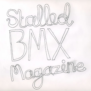
I drew out the text above, i think the loose hand rendered style has a carfree light feel and I think the fact its lo-fi fits in with the punk DIY ethic of Stalled and BMX magazines.


Above are some initial designs I did for the black on white hand rendered Stalled T-shirt, I think they work quite well and because the type was drawn specifically with a t-shirt in mind it fits well.


Above is another idea for a T-shirt using a film negative shape. Again I like these, BMX magazines and photography go hand in hand so I think the film motif is quite appropriate. I think they work but I am more into the hand rendered design.


Like I said ideally I would like to print the design on a black shirt, however talking to Ollie Shaw who has screen printed a lot of T-shirts I get the impression that printing black on white can be quite difficult to do. So I produced some designs that could be printed on white shirts. I like them and think they are pretty successful.
The one pictured large overlays the film negatives and the hand rendered type. I really like it but I think it might be a bit of overkill. it would also be a 2 colour print which would be more time consuming.
No comments:
Post a Comment