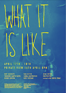
After taking on board the comments in the email from Paul I did a second round of development for the poster.
The main points that they made were:
- The name of the exhibition should be bigger
- The name of the gallery did not need to be so prominent
- The names of the artists needed to be bigger
- They wanted it to feel 'younger' or 'less serious'
- They wanted the background image to be 'more like a colour' or 'more ambiguous'
- They also wanted me to try out some designs with the title 'what is it like' and what it is like'
- There were also some minor chnages to the copy


No comments:
Post a Comment