Wednesday 24 March 2010

Crit Feedback


The feed back from the crit was mostly positive, people seem to think i am moving in the right direction.

One of the main criticisms was that the stalled T-shirt was not consistent with the magazine logo. However I considered this and decided that I wanted the T-shirt to have a different feel to the magazine. It would have been very easy to slap a stalled logo on a T-shirt but I wanted the T-shirt to stand alone; while tying in with the stalled identity it should have its own style. I've produced an insert and tag to go in with the shirts to make it make it feel more consistent with the rest of the identity.


Tuesday 23 March 2010

Fine Art Year Book Changes

We made a small change to the fine art year book today following last weeks meeting. the colours on the cover and inside cover have been swapped around. We now have a black and white outside cover and the green/blue and white inside cover.

The people we are meeting with in fine art have finally got (almost) all the images and text we need to work with so we can begin to lay it out in time for our next meeting.


Fine Art Poster Round 2

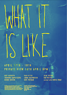
After taking on board the comments in the email from Paul I did a second round of development for the poster.

The main points that they made were:
- The name of the exhibition should be bigger
- The name of the gallery did not need to be so prominent
- The names of the artists needed to be bigger
- They wanted it to feel 'younger' or 'less serious'
- They wanted the background image to be 'more like a colour' or 'more ambiguous'
- They also wanted me to try out some designs with the title 'what is it like' and what it is like'
- There were also some minor chnages to the copy


Fine Art Poster

This is the response to the posters I sent through to Paul regarding the Ta Kea Way Exhibition.

Hi Angus!
Thank you very much for your help! your first ideas are really cool! and
quick!!
It took us a while to come to a conclusion. TOO MANY COOKS..
However..we liked poster number 6 and 4 the best.
Taking them as a basis here our ideas:
the image could be even more pixelated or zoomed in.
could you play a bit with the saturation and the colour? -we liked 16 as
well! It would be nice if the image gets a bit more background, more a
colour, more ambigious..
The name is definately the most important thing. it should be bigger,
maybe fatter, maybe another font. It could go (almost) from one side to
the other..I think it could be a bit less serious..hm.. or a bit
younger.. if you know what i mean.
the name of the galerie should just stand on top of the location
section. -unfortunately we can't use the name "the old globe galerie"
please use "showroom Curtis Mayfield House - formerly known as globe
galerie" or so instead.
The artists should be bigger and in alphabetical order. and we don't
need "list of artists" and "location"
please also write "Curated with Denise Kwan" at the bottom of the list.
We might have 1,2 sentences to explain whats happening. that its art,
that its about a certain theme.. these have to be thought out and
written down by Denise untill tomorrow! Could you just use a dummytext
for that?
And could you please try "What is it like" and "What it is like" as a
title as well?

I hope that's something to work with!

cheers
Paul

Monday 22 March 2010

More Screen Printing

I finally got round to screen printing the T-shirts for Stalled magazine today. Overall they came out pretty good but I think screen printing on fabric takes a certain level of skill that I havn't quite acquired yet because they aren't perfect.

The white on black is a bit patchy because the opaque white ink dries so quickly that it clogged up the screen. And I think the screen was a bit blocked at the very bottom because the small website url type has not come out well on any of the t-shirts.

Anyway they will be fine to photograph, I will just have to photoshop out the small misprints for the boards.


Shona MacPherson Postcards

I printed out and matt laminated the post cards I had design for Shona MacPherson. I think they look OK although I am not really blown away by them. I don't know if its because I have removed the type which was on the business cards or if its because I didn't really spend enough time choosing the right images to use on them, I've realised there are some really nice images that I over looked when putting together the cards.

Either way I think its worth taking the time to tweak them and re-print them so that they have a bit more wow factor.


Ta Kea Way Exhibition

I started designing the poster for the exhibition my sisters involved with. Originally it was going to be called 'Terra Firma' but half way through me coming up with some initial ideas my sister phoned up telling me they were going to call it Ta Kea Way instead. Hence the first few designs with the words Terra Firma on.

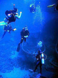
I had 2 low res jpegs to work with. In the email they said ' don't worry about the bad quality of the jpegs it makes it look even cooler' ! I don't know how comfortable I am with this, if your going to use a pixelated jpeg it should be pixelated for a reason, so I needed to come up with some ways to work around it.


The first few designs (above) are just really getting a feel of how much copy there is and what the hierarchy needed to be.


I email through the best poster designs. I'm waiting to here what they think, then I will move the project through to the next stage.

Shona MacPherson Business Cards

My sister sent me some more up to date images that she would like to be used on her business cards.


Art Poster

Well my sister got in contant with me to ask if I would be able to design a poster for another exhibition she is involved with. I said no problem. They want a double sided A6 flyer, an A3 poster and a pdf e-invitation. This project might also lead on to possibilities of designing an exhibition catalogue as well.

Below is the email they sent me, and below that some of the images they sent through that they want me to work with.


Sunday 21 March 2010

YTD Bags

I Screen printed the YTD tote bags last week. I think they look good good but unfortunately we didn't get the printing bang on.


Some araes didn't get enough ink.


And the YTD logo was a bit too fine so the detail didn't come out that well.

I'll have to photoshop them up for the boards but they should look fine.