Friday, 26 February 2010

Stalled Magazine - Where I'm at

Here are the Stalled spreads after adding the template and baseline grid and changing the margins a little bit. Blogger has changed the order that they will actually appear in. Overall I'm pretty happy with how it's looking. I'm just waiting for a few photos from Will Davis, I'll make some final tweaks then get it printed.


Stalled Grid

Well I had a chat with Joe a couple of days ago and showed him what I had done for my stalled magazine project. I wasn't using baseline grids or a page template that ran throughout the magazine. He showed me how to set up a baseline grid and how I could use a template so all the page elements would be in the same position on every page, I think this has improved my spreads a lot.

Below you can see the baseline grid and the guides that mean information is consistently laid out throughout the magazine. I also set up Paragraph styles which saves so much time when laying out new sections out and making changes.


Scott Tedder Photography

My good friend and talented photographer Scott Tedder sent through some words and photos to use in satlled magazine:

iv just renamed all the photos, so cant really see which ones you wanted. but i think i remember. i dont now whether u meant the granny one or the peg one.

The one with all the colours. - this is the first photo i took with my Olympus Om2n, it was in the now deceased borders (R.I.P), iv no idea what their use was, but i liked the scales of colour so had to get a quick snap.

the one with the dog- this is alfie, he lives next door and is small enough to fit through the fence and therefore can get into my back garden anytime he wants and regularly surprises us in out house when a door is open. this was taken in one of these surprise visits, at a time when he’s slowed down enough to snap him. he usually just runs around my house as fast as he can whilst we have to wait it out.

the one with the gran- this is my granny, it was her birthday and we got her some big flowers, so i took a few pictures whilst she posed with them.

the one with the camera- this is angus’s new/old nikon film SLR, in the past 6 months it seems like film has taken over digital amongst my friends with nearly all the one’s that used to use digital purchasing film SLR’s online and snapping roll after roll every week.

the one with the rocks- this is a collection of rocks in my back garden. it was one of the photos taken just to fill up the roll, but it ended up been one of my favourites from the whole roll.

the one with the peg- this was also taken just to fill the roll, and also turned out been one my favourite, i love the f1.8 aperture on the 50mm lense, so its interesting seeing what good depth of field perspectives i could find around my house.




York Clinic Leaflet - Live Brief

I was asked to do a leaflet for my Dads work, York Clinic for Complimentary Medicine
After a meeting we decided on an A4 gatefold, the leaflet is to promote the clinic and provide information on the services they offer.


The 3 designs directly above were the first intitial direction I sent through. The photos used in the background were all taken by me in the clinics grounds. My personal favourite is the 3rd design but Harriet, the woman who I am liasing with, prefered the first.


Above is the inside spread of the leaflet.


Harriet was happy with the overall design but asked for a few changes to the cover. Above is the leaflet after the amendments, that I have just sent off. So I'm just going to wait and see what she thinks.

Thursday, 25 February 2010

Young Typographic Designers Screen Print

I screen printed the poster for the typography exhibition identity I am designing today.

The reason I chose to screen print it as opposed to digital print was because, I want this poster to have a real aesthetic beauty and impact. It is a poster for an exhibition of beautiful typography and the poster needs to stand up along side the work it is representing.


I am happy with how the final poster turned out. The colours feel really nice and vibrant and its quite high impact.


I also screened some posters onto paper that I had already printed multiple private view invitations on the reverse side, so that when the invitations were chopped up it gave a abstract pattern on the back. I did some on grey board and some on 300gsm cartridge paper to see which I preferred. I think I will probably go for the grey board as it has a real solid and unique feel.

Exhibition Signage

I spent a bit of time laying out the blurb for each of the designers involved in the exhibition.


I tried to center aligned it, because a lot of the other parts of the identity are center aligned. However I don't really think it works for this kind of caption thing.


I also tried to encorporate some of the red diagonal lines that I have used in the rest of the identity. However I don't really think they have the same sort of feel that they have in the poster and in the other parts of the signage.


In the end I think that the really simple design above works the best and is most appropriate. The caption for the art work shouldn't really compete with the artwork for attention, so I think the simplest design is probably best.

I made a master grid, as you can see in the image below, so that all the elements will be in the same position in all the captions. They are slightly larger than A6 and will be mounted on foam board when they're finished.


Exhibition Signage

OK I'm moving ahead with the Young Typographic designers brief. I had a good chat with Joe yesterday and decided that I am not going to put on the exhibition, this will give me much more time to spend designing the identity which is what I really want to do.

I've spent today doing the signage. Below is the main information sign for the exhibition, they are going to be a tall thin crop of an A3 sheet. You probably need to click the images to see them properly.


I Experiemnted with a few different layouts, I wanted to keep it really clean and inline with the rest of the identity.


I think I will use the one directly above, as it is most consistent with other elements of the identity, and aesthetically I think it is the most pleasing.

Wednesday, 24 February 2010

Photographs for York Clinic Leaflet

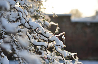
I have taken a series of photographs which I am going to use to base the look of the York Clinic leaflet around. The York Clinic is set in a large Victoria building with beautiful gardens. I felt that they really reflected the tranquil, natrual ethos and atmosphere of the clinic.