Monday, 31 May 2010

Fine Art Year Book Photos


I shot some photos of the fine art year book that I did with Tom and Ollie on friday. I experimeted with a few different backdrops. I thought that blue might be nice as it goes with the sea theme however it was too similar to the blue in the books and it did look very good. In the end I went with grey. I think the details on the books really stand out and overall it looks very nice and sleek.


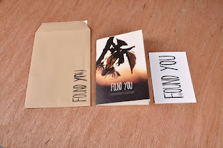
Found You Photos


I got in to use the photo studios again on friday and shot some photos of the finished Found You project that I have done with Deano. I experiemnted with a wood grain backdrop, I thought that it was appropriate because of the fairly earthy organic feel of the project. However the printed products kind of melted into it and didn't look that good, in the end I went with the dark grey backdrop which I think showed them off to their best.


Thursday, 27 May 2010

Fine Art Year Book Delivery

Today was a very exciting day as the fine art year books arrived back from the printers. They look gorgeous; I think they have come back better than we all expected. So we are very happy. Unfortunatly the flyers that were also printed at Jade seem to have been cut down to size with a blunt blade and as a rusult a lot of them have frayed edges. They are probably going to be sent back to the printers to be re-done.


Historical Character Format

As the final resolution to my Historical characters brief I've decided to produce a type specimen package/mailshot. It comprises of 2 leaflets, one documenting each typeface and 6 posters (3 for each typeface) demonstrating how the font can be used and showing off the design and letterforms. Each poster and leaflet is a 6 panel consortia fold sheet, they are all packaged between 2 pieces of greyboards and held together with a band.

Below are some photos of a small scale mock up I have made. Obviously changes are going to be made for the final piece.


The final product will have screen printed outer pieces of board. The band will have printed information on.


These are the final eight posters and leaflets I have chosen. I think some changes might need to be made to them. The branding needs to be in a consistent place on all of them. I might make some slight tweaks to their colours to make them all hold together a bit better.

Historical Character Posters

I decided to produce a set of posters to go with the type specimen leaflets I had done. Posters are a great way of displaying the different ways the typefaces can be used and seeing all the different shapes and forms at a large scale.

I new the format and colours I wanted to use, so with this in mind I produced a large number of variations using the two different typefaces.


I also produced the above design in photoshop, overlaying the typeface onto a halftone image of a train. I like the look but feel it is moving too far away from the look of the rest of the posters and leaflets.


Once I had got to a stage where I had produced a large number of designs I was happy with, I printed out a contact sheet and made some decisions about which ones to go with. You can see the 6 I am taking forward below.


Wednesday, 26 May 2010

Historical Character Set Promotion

Once I had finished the typefaces, I wanted to produce some promotional material to show them off to their best and display the way in which the character forms can be used. I also wanted to include some of the sources of inspiration they draw from and a little bit about how they were constructed. The most obvious way to do this was in a booklet.

One of the first things I did was to construct some illustrations of the vectors I used to create the typefaces. Which you van see below.


I decided to use a narrow format for the booklet. However once I had printed out a full scale mock up I felt that this wasn't the most appropriate way to show the fonts. The pages felt too small, I really wanted to see the letterforms at a large scale, both typefaces are fairly wide so narrow pages felt quite constricting. Also everytime I picked it up it made me think of a menu.


Once I had decided that I wasn't happy with the narrow format I put the content onto a long concertina fold poster/booklet. This feels like a much more appropriate way of displaying the typefaces. There is much more space to display large characters and because it is a fold out format there is more freedom to break the margins and go over several pages.


Sunday, 23 May 2010

Found You Development

Overall I am pretty happy with how this project has come together, however there were still a few things that I didn't think were working interms of the layout and typography. I also felt there were some ways we could extend the project that we weren't fully exploiting.

I had a bit of a brainstorm, which you can see below. I thought it would bve a really good Idea to make a found you stamp, which we oreded from craftwise. We can stamp this on the envelopes when we send out the books. We also made some bespoke cards, so rather than just using one of the spreads from the book as a flyer, we actually put together a specially designed card, taking into consideration the stock it's printed on etc.

Finally a few of the layouts of the book have been changed, which makes it flow a bit better, overall I am happier with it and think it is a more copmplete project.


Wednesday, 19 May 2010

Fonts - Final Changes

Well I've spent some of today making the final set of changes to my typefaces. They are all fairly minor but I think it is really important to get all the details right in oder for the typeface to feel consistent.


I spent some time just typing out some common words with the typeface, to get a feel of which letters are and aren't working.


Above is the new R and the old R. I thinned out the bottom of the loop and made the decender come out at less of an angle.


I felt that in certain situations the spiky N was not working. I made one with flat ends. Its available in the uppercase N, which means that it can be used in certain situations.


The K was probably the weakest character in this typefaces, the top one is the original. The new one sits with the other characters much better.


Again I made a less distinctive E (Bottom) available as an alternate.


The only letter I changed in Grande Fete was the S making it less curvaceous and the 2 loops a similar size. Above you can see them both overlayed.