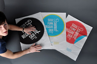
Me and Phill got a lot done yesterday. We've stuck with the same concept but the final resolutions have changed a bit. We've used a different logo and simplified the posters a lot. We felt that
the last version was too busy and cluttered. So we decided just to use the main logo and get rid of all the smaller sticker/seal logos in the background.
We are both really happy with the new design. Their more classic, slightly vintage feel is much more appropriate for a reggae night in York I think.
The vinly sleeves have stayed pretty much the same although the logo has changed a bit so we printed out a new sticker to go on the front of it, which you can see phill sticking on in the photos below.

Above: Die cut stickers for the record sleeves

^Phill placing the sticker


^Record Sleeve

^Above: From left to right is the flyer, record sleeve and beers mats to accompany the night.

^Set of three posters for the first three dates. All with similar but subtly different branding.


