Friday, 4 June 2010

OUGD303FMP Evaluation

This module I feel as though I have, to quite a large extent, managed to achieve what I set out to do in my FMP statement of intent. I have done a lot of project for clients that could be described as being part of the cultural sector, such as Between Us and This Exhibition poster and my work for the fine artist Shona MacPherson. I have managed to mix this with doing slightly more commercial work, like Stalled magazine and the Leaflets for York Clinic. Although I maybe have not done quite as much commercial work as I would have liked.


As I said in my statement of intent my work has been predominantly focused on typography and layout, and I think I have managed to push myself in new directions with this. Stalled was my first attempt at proper editorial design, I leant a lot and I think took it to the next level laying out my design context publication. I think I took my typography skills in news directions with the historical character set brief. I learnt a lot about the way letters are constructed, letter spacing and kerning and also about using software to create fonts.


In my statement of intent I said that I wanted processes and finishing techniques to be a primary concern within my work. Although they haven’t been at the very centre of what I do I think that I have improved my skills and knowledge of them. I see them as a very important part of my work as knowledge in this area helps me achieve the look and finish I want in my pieces. I used screen-printing in my Young Typographic Designers Project and Historical Character Set, and although other than that I predominantly used digital print I think I utilised materials, formats and folds quite effectively.


I said that I wanted to have a strong concept behind all my work in this project. I don’t think I have necessarily had a clever message or thing to say behind all my projects but I do think that every brief I have done in this module has had a solid concept and idea behind it. In terms of who it is aimed at, what I am trying to communicate with it and where I see it existing in the real world.


I did a lot of collaborations this module, I think I maybe did one too many, as I would have liked a bit more time to work on my own projects. However I think that ultimately in every case I got something out of them. Found You, the collaboration between me and Dean was maybe the most interesting as we have very different skills and interests and therefore created something that we couldn’t have done individually. The fine Art yearbook, Me, Ollie and Tom did was really interesting, although we all wok in a similar areas of design, in the project we managed to delegate well and all filled different roles. Plus we got to have our work professionally printed, which was very exciting. In the Bassment Collaboration with Phil Armson, we had quite similar skills within design but very different styles, I think we came together well and produced some of my favourite work in this module.


I have leant a lot about maximising a project this module, applying an identity to lots of different products and medias, I think I did this particularly well in the YTD project where I applied the identity to, posters, editioned prints, leaflets, invites, flyers, bags and badges. Something I set out to do in my statement of intent was to utilise photography in my practice. I have used it a lot; in the Found You and York Clinic briefs it was a pivotal part of the project. I also think I have greatly improved my skills in terms of taking product shots this module, which is really useful in terms of having a strong portfolio.


Between Us and This was a live brief I undertook for a group of artists in Newcastle. I didn’t enjoy the brief and didn’t feel I produced particularly good work. However I learnt a lot about how to deal with clients, I felt as though I gave them too much choice and therefore they didn’t commit to an idea. In the future I would be more definite about the designs I gave to them so they didn’t have the opportunity to be so indecisive.


Wednesday, 2 June 2010

Type Specimen Studio Shots

I used the photo studio yesterday to get some shots of my type specimen package. I shot them on a white background to get a really clean clinical look.


Type Specimen Bands

The band for the type speciemn package is really simple and i didn't want to over design it. I did a few quick alternative layouts for it. Just to see how the information would best sit (below)


The when I had settled on a design I tried printing it out in a few different ways. Printed on plain white paper, reverse out on red paper and simply reverse out on white paper. I like how it looks on red paper but I don't think it ties into the rest of the idenity so well. In the end I went for reverse out on white paper. I think it is simple classy and ties into the identity well.


Type Specimen Cover Boards


I experimented with a few different lkayouts for the cover boards for my type specimen package.

I wanted it to have a really bold chunky feel so I decided to screenprint the boards. As well as printing a regular black onto the boards I also printed a spot varnish on top of it. It has come out really well, it's got a shiny almost 3D look and I think it feels really highly finished and quality.


Monday, 31 May 2010

Fine Art Year Book Photos


I shot some photos of the fine art year book that I did with Tom and Ollie on friday. I experimeted with a few different backdrops. I thought that blue might be nice as it goes with the sea theme however it was too similar to the blue in the books and it did look very good. In the end I went with grey. I think the details on the books really stand out and overall it looks very nice and sleek.


Found You Photos


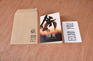
I got in to use the photo studios again on friday and shot some photos of the finished Found You project that I have done with Deano. I experiemnted with a wood grain backdrop, I thought that it was appropriate because of the fairly earthy organic feel of the project. However the printed products kind of melted into it and didn't look that good, in the end I went with the dark grey backdrop which I think showed them off to their best.


Thursday, 27 May 2010

Fine Art Year Book Delivery

Today was a very exciting day as the fine art year books arrived back from the printers. They look gorgeous; I think they have come back better than we all expected. So we are very happy. Unfortunatly the flyers that were also printed at Jade seem to have been cut down to size with a blunt blade and as a rusult a lot of them have frayed edges. They are probably going to be sent back to the printers to be re-done.


Historical Character Format

As the final resolution to my Historical characters brief I've decided to produce a type specimen package/mailshot. It comprises of 2 leaflets, one documenting each typeface and 6 posters (3 for each typeface) demonstrating how the font can be used and showing off the design and letterforms. Each poster and leaflet is a 6 panel consortia fold sheet, they are all packaged between 2 pieces of greyboards and held together with a band.

Below are some photos of a small scale mock up I have made. Obviously changes are going to be made for the final piece.


The final product will have screen printed outer pieces of board. The band will have printed information on.


These are the final eight posters and leaflets I have chosen. I think some changes might need to be made to them. The branding needs to be in a consistent place on all of them. I might make some slight tweaks to their colours to make them all hold together a bit better.

Historical Character Posters

I decided to produce a set of posters to go with the type specimen leaflets I had done. Posters are a great way of displaying the different ways the typefaces can be used and seeing all the different shapes and forms at a large scale.

I new the format and colours I wanted to use, so with this in mind I produced a large number of variations using the two different typefaces.


I also produced the above design in photoshop, overlaying the typeface onto a halftone image of a train. I like the look but feel it is moving too far away from the look of the rest of the posters and leaflets.


Once I had got to a stage where I had produced a large number of designs I was happy with, I printed out a contact sheet and made some decisions about which ones to go with. You can see the 6 I am taking forward below.


Wednesday, 26 May 2010

Historical Character Set Promotion

Once I had finished the typefaces, I wanted to produce some promotional material to show them off to their best and display the way in which the character forms can be used. I also wanted to include some of the sources of inspiration they draw from and a little bit about how they were constructed. The most obvious way to do this was in a booklet.

One of the first things I did was to construct some illustrations of the vectors I used to create the typefaces. Which you van see below.


I decided to use a narrow format for the booklet. However once I had printed out a full scale mock up I felt that this wasn't the most appropriate way to show the fonts. The pages felt too small, I really wanted to see the letterforms at a large scale, both typefaces are fairly wide so narrow pages felt quite constricting. Also everytime I picked it up it made me think of a menu.


Once I had decided that I wasn't happy with the narrow format I put the content onto a long concertina fold poster/booklet. This feels like a much more appropriate way of displaying the typefaces. There is much more space to display large characters and because it is a fold out format there is more freedom to break the margins and go over several pages.