Showing posts with label Shona MacPherson Exhibition. Show all posts

Friday, 30 April 2010

FMP Photoshoot

Me and Phill used the photo studios today to shoot some of our most recently finish projects.


Monday, 22 March 2010

Shona MacPherson Postcards

I printed out and matt laminated the post cards I had design for Shona MacPherson. I think they look OK although I am not really blown away by them. I don't know if its because I have removed the type which was on the business cards or if its because I didn't really spend enough time choosing the right images to use on them, I've realised there are some really nice images that I over looked when putting together the cards.

Either way I think its worth taking the time to tweak them and re-print them so that they have a bit more wow factor.


Shona MacPherson Business Cards

My sister sent me some more up to date images that she would like to be used on her business cards.


Monday, 15 March 2010

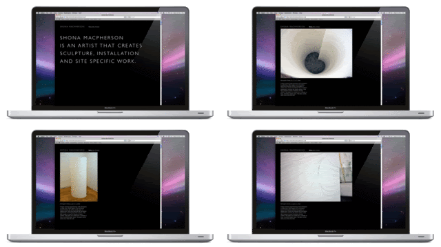
Shona Website Gif


I sorted out an animated gif flicking through a few pages of Shona's site. I decided to go for the black background, I think the images stand out so much better on it and somehow on screen a black background seems more appropriate.

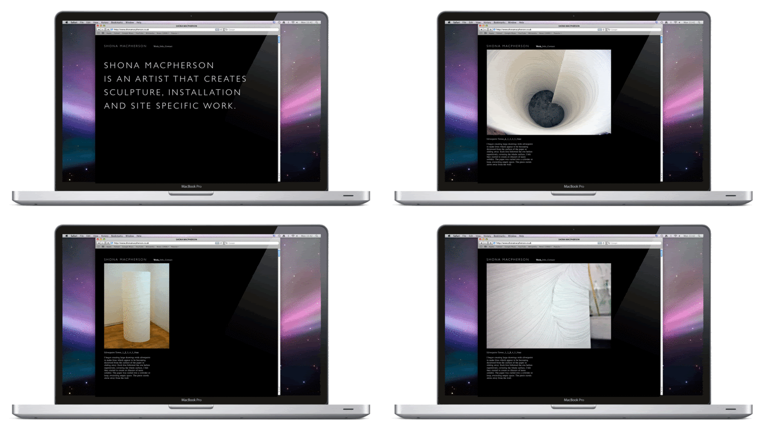
Shona Website Mock Up


I quickly superimposed the design for Shona's website into a browser on on a Macbook pro. It give you a nice idea of what the finish thing might look like (click them to see them larger). After looking at this I think I might need to reduce the padding around the top and left hand sides of the webpage.

Shona MacPherson Website

OK I've spent today designing a website to display Shona MacPherson's art. It need to be really simple so that the art is allowed to speak for itself. I've been trough a few different stages and I think the most important thing is that the information and navigation is organised logically and that I develop a template that will work across many different pages containing different types of information.

First i quickly scetched out some simple layouts by hand, considering what I thought might be the best way of ordering the content.


After that I moved onto photoshop to start mocking up some designs.


The 2 images above are the first layout I designed. They are OK but not perfect the layout of the info and navigation feels a bit clunky. I have used Gill Sans light across the rest of Shona's identity but this isn't a web-safe font so I used Helvetica on this particular design. I don't think it fits in with the rest of the identity, it looks too modern and bold.


Above are 2 images from my second proposal for her website. Aesthetically it is probably my favorite design. However I have set the images so they would be page background images and while this looks nice I really don't like it as a way of displaying images that you actually want to look at in detail. Also for the splash/mission statement part of the site I have used Times italic, while it looks nice it moves away from the original identity I design and want the website to be consistent with.


Above are 2 images from the 3rd version of the site I layed out. Its quite similar to the first but I wanted to make the title a bit bolder. It also uses Times which is a web safe font but I think it feels much more consistant with the rest of the identity; more ornate and elegant. The overall design looks fine but the way the info is organised isn't that elegant and I think I can do better.


The 5 images above are from the final version of the site and the one that I am going to run with. The navigation and way the info is laid out is the simplest of them all, but that's why I think its the best. The way I have laid it out means that the template will work well for all the different pages on the site.


Above you can see the guides I used to organsie teh site. They are really simple and I think that is why the design seems to work so well.


I also tested out my final layout on a black background. I actually think it works really well and makes the images really stand out. It's not entirely consistent with the rest of the identity but that might be OK.
Thursday, 11 March 2010

Shona MacPherson Postcards

I designed some postcards for Shona, they really came from the business cards and how nice the images looked when they were cropped so you could just see the detail. The layout has to be really simple as I want the artwork to be the thing that you notice.

The back is very simple and it's really just a case of deciding how best to organise the information. I have stuck with the same way of setting up the type as I have used throughout her identity.


Originally I wanted to include her name on the front of the postcards, as I think the type works really well with the images, and it maintains the identity. However after experimenting with where to position the type I realized that it would have to be in a different place on each postcard which I don't think would look good, I think consistency is very important when the overall design is so simple. Also I think not having the type on the front means that the artwork is not obstructed in any way.

Below are some of the postcards with the type on, as you can see the type would not work in the same place in all of them.


Monday, 8 March 2010

Tutorial Feedback


After my tutorial with Fred I have decided to slightly change the way I'm going to organise the next few weeks. I was going to finish up with all the projects I have been working on and start on some new briefs. However Fred encouraged me to fully exploit the potential of all the projects I am working on currently.

So these are the ways in which I am going to extend my current projects:

Young Typographic Designer:
-Produce a range of editioned prints to go along with the exhibition
-Produce a set of typographic post cards to also go with the exhibition.
-Tote bags?
-Mugs?

Stalled:
-Fully exploit possibilities of digital delivery, including Issuu

Shona MacPherson Exhibition
-Produce a set of postcards of Shona's work
-Possibly produce a set of posters of shona's work